Previous Articles

Keeping out of trouble This article was posted on Tuesday, 3rd July 2012

I've been busy lately, preventing me from adding to these sprawling archives. I have several updates to implement throughout this site, but until I get some free time to finish them, they'll have to remain orbiting in the stratosphere. Meanwhile, I've been keeping off the streets and out of trouble, kept busy with...

My strawberries

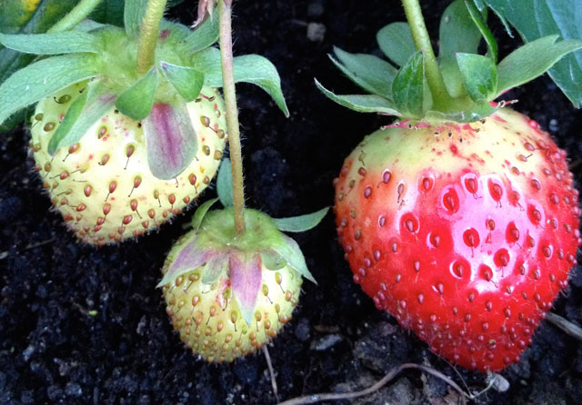
Gardening- As it is is summertime, I have been spending significant time in my vegetable garden. There has been a lot of rain and heat recently and my crops are growing, but so have the weeds. It's a constant battle keeping the weeds, slugs and birds away from my produce.

All Seeing

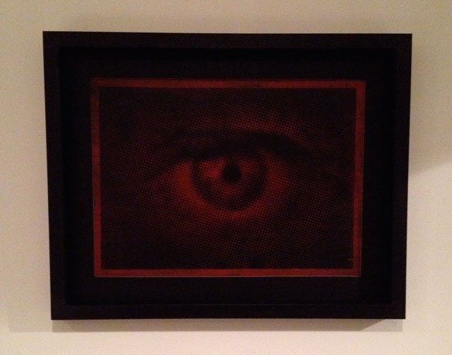
Being artistic- The last couple of weeks I have been preparing art for the Athy Art Group's annual exhibition. I designed and screened two pieces for the exhibition. The piece above is titled All Seeing. They're both single colour prints on painted plywood.

Luas

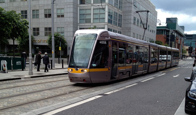
Working- I've also been working for Storyful, commuting to and from Dublin. I'm one of two senior designers on staff. We're creating a new wave of websites, to support their professional services. Storyful have about 30 journalists looking for and validating user generated content throughout the web for use in the mainstream news industry. It's a great place to work and I'm having a great time working there.

In between everything else, I'm trying to sneak bicycle rides in at every point. Hopefully when I get better equipped to commute and compute, I will be able to post more regularly.
 

My home office, devilishly charming? This article was posted on Tuesday, 22nd May 2012

Article Thumbnail from Apartment Therapy
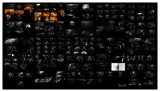
Much to my bemusement, whilst I was reading my RSS feeds this morning in Google Reader, I came across
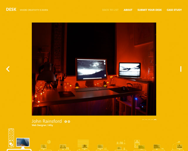
 a post on Apartment Therapy called 'John's Devilishly Charming Desk'. As I am quite fond of looking at other people's workspaces, I eagerly clicked and noticed some familiar photos. It seems that the John they were referring to, was me.

My desk photos seem to do the rounds quite a bit. They were featured before, on Unplgged, (who are the same company as Apartment Therapy, I think), but I was unaware that AT were publishing them, again. (I wrote about the initial publishing on Unplgged here.)

The motivation for the supposed republication was probably because my photos recently featured on the DESK site here- they contacted me and requested permission to feature them and I happily agreed. Apart from needing Flash to view, the DESK site is really nicely designed and has some great desks featured on it- I highly recommend it. If you're interested, I have the original high res photos on Flickr, here and here.

Screenshot from DESK website

I don't get to use my home office as much as I used to when I worked there almost full time, so it has become a little neglected. I have to buy a new desk and some other bits and pieces soon, so maybe I'll do another 'photoshoot' when that's done.

Moving Images: Predators This article was posted on Thursday, 10th May 2012

I like movies for many different reasons, the story, the script, the characters, the visuals, the actors or just a combination of the aforementioned. I thought the 2010 film Predators had many flaws, but I liked the characters, the premise of the story and most especially the visuals. It really had some great scenes, which I have screen-grabbed and included below.

My favourite scene? The Yakuza versus the Predator scene. Everything about it just came together to be a really nice visual. The lighting is moonlight, the location is a wild grass pasture, the characters are a heavily tattooed Japanese gentleman and a big hulking Predator. The juxtaposition is really great.

Worth watching the movie for the visuals alone or just enjoy the images below.

Predators Screenshot

Predators Screenshot

Predators Screenshot

Predators Screenshot

Predators Screenshot

Predators Screenshot

Predators Screenshot

Predators Screenshot

Predators Screenshot

Predators Screenshot

Predators Screenshot

Predators Screenshot

Predators Screenshot

Predators Screenshot

All images are © 2010 Twentieth Century Fox.

Brilliant Branding: St. Barts This article was posted on Thursday, 26th April 2012

Not all new branding needs to follow the latest trends and use so-called 'modern' typefaces. Case in point- the branding solution for Saint Bartholomew's Church, which won the Best of Show in the 2011 Brand New Awards.

St. Barts

There are many things I like about this identity. The typography is a nice blend of old carved type, lifted directly from the Church walls, and Carter Sans by Matthew Carter. Carter Sans is a very legible and clean sans-serif, with loads of character (no pun intended) without being too ostentatious. The sub-branding is nicely consistent- a circular motif is maintained through the branding, with a selection of iconography and text-within-circles, to denote the different aspects of the church. I love the fact that not only is the branding incredibly comprehensive, there is also so much room for expansion.

St. Barts Iconography

The branding is designed by the Original Champions of Design- you should check out their case study page as well as the rest of their work. They do some great work, kudos.


The Girl with the Dragon Tattoo This article was posted on Monday, 23rd April 2012

Just after Christmas last year, I saw the David Fincher remake of The Girl with the Dragon Tattoo. I thought it was a better interpretation of the original novel than the Swedish film. I thought they had a great cast of actors, and I felt that both Daniel Craig and Rooney Mara portrayed their respective characters better than their Swedish counterparts. I thought the film was shot, edited and paced a lot better too-it's a long movie, two hours and forty minutes, but it doesn't seem like a long journey. More like a tough journey.

Dragon head

As with all David Fincher movies, the attention to detail is brilliant. Every little element on screen has been thought about and is there for a reason. I think this is probably why this movie appeals to me a lot- as a designer, it's those tiny little details that 99% of people do not see, but are there, that excite and interest me. They are the threads of a fine woven garment.

Scenes from the Title Sequence

The Art of the Title Sequence, a website celebrating movie title sequences, posted an article about TGWTDT when it was released in the cinema, and I'm sure I posted it to Twitter. Having watched the movie again on Blu-Ray, I thought the article deserved a mention on a blog post because it is really good.

The Girl with the Dragon Tattoo Title

It consists of interviews with David Fincher, Tim Miller from Blur Studios- the company which created the title sequence and, Neil Kellerhouse, the designer who handled all the graphic elements for the movie.

Amazing and inspiring work.

All images were taken from the Art of the Title Sequence without permission and I do not claim ownership for any of the images in this blog post.

⇠ Newer Articles Older Articles ⇢

Contents © 2008 - 2024 John Rainsford. All rights reserved. Hosted by Blacknight.