Not all new branding needs to follow the latest trends and use so-called 'modern' typefaces. Case in point- the branding solution for Saint Bartholomew's Church, which won the Best of Show in the 2011 Brand New Awards.

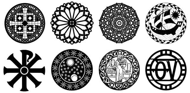
There are many things I like about this identity. The typography is a nice blend of old carved type, lifted directly from the Church walls, and Carter Sans by Matthew Carter. Carter Sans is a very legible and clean sans-serif, with loads of character (no pun intended) without being too ostentatious. The sub-branding is nicely consistent- a circular motif is maintained through the branding, with a selection of iconography and text-within-circles, to denote the different aspects of the church. I love the fact that not only is the branding incredibly comprehensive, there is also so much room for expansion.

The branding is designed by the Original Champions of Design- you should check out their case study page as well as the rest of their work. They do some great work, kudos.