Just after Christmas last year, I saw the David Fincher remake of The Girl with the Dragon Tattoo. I thought it was a better interpretation of the original novel than the Swedish film. I thought they had a great cast of actors, and I felt that both Daniel Craig and Rooney Mara portrayed their respective characters better than their Swedish counterparts. I thought the film was shot, edited and paced a lot better too-it's a long movie, two hours and forty minutes, but it doesn't seem like a long journey. More like a tough journey.
.jpg)
As with all David Fincher movies, the attention to detail is brilliant. Every little element on screen has been thought about and is there for a reason. I think this is probably why this movie appeals to me a lot- as a designer, it's those tiny little details that 99% of people do not see, but are there, that excite and interest me. They are the threads of a fine woven garment.

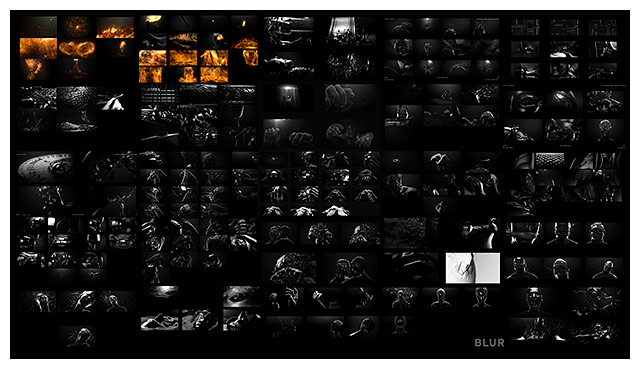
The Art of the Title Sequence, a website celebrating movie title sequences, posted an article about TGWTDT when it was released in the cinema, and I'm sure I posted it to Twitter. Having watched the movie again on Blu-Ray, I thought the article deserved a mention on a blog post because it is really good.

It consists of interviews with David Fincher, Tim Miller from Blur Studios- the company which created the title sequence and, Neil Kellerhouse, the designer who handled all the graphic elements for the movie.
Amazing and inspiring work.
All images were taken from the Art of the Title Sequence without permission and I do not claim ownership for any of the images in this blog post.