Previous Articles

Revision: Less demure, more allure This article was posted on Monday, 8th October 2012

I blogged before about how Michael Gillette was able to redo the image for the German reprint of the Ian Fleming novel Thunderball, but it seems he's at it again for On Her Majesty's Secret Service.


On Her Majesty's Secret Service

He says-

"I was happy with the Penguin cover, but over time she seemed a little too demure to be the one to take his heart all the way to the altar. This version has more allure."

Whereas the Thunderball revision was due to issues with reproducing it in print, I just love the fact that he decided to redo this cover to add 'allure'. Nice.

Friday Hijinks This article was posted on Friday, 5th October 2012

What can I say? Not really a political statement- the photo and colours seemed perfect for exploitation.

However, if the shoe fits...

Brand New Conference 2012 This article was posted on Tuesday, 2nd October 2012

It's no secret that I am a big fan of Under Consideration's Brand New- I regularly link to their brand-review articles. They held their Brand New Conference at the beginning of September and they released the video footage of the conference, for purchase, a couple of weeks ago.

I was familiar with several of the speakers so I decided to download the videos. Whilst I enjoyed all the talks, the following were high points for me:

Simon Manchipp of Someone gave a really entertaining talk, loaded with animated GIFs, and some very interesting ideas. He spoke of designing a branding system, rather than a branding mark (logo). His example of the figures used in the London 2012 Olympics were very clever.

Yolanda 'Yo' Santosa of ferroconcrete gave a great talk about, amongst other projects, branding Pinkberry Frozen Yoghurts, Hustler Sex Toys (that should improve my Google hits) and her own project Fruute.

Aaron Draplin was as entertaining as ever- I still want to see the part that they cut out of the recorded presentation. I may have to visit Belfast to see him live.

For Massimo Vignelli, it was more of a chat with the host Armin Vit than a presentation, but it was still very interesting and informative. Vignelli is one of the old masters of branding and design, with work going back to the sixties.

Mike Rigby of Interbrand Australia gave a great presentation and touched onto a similar thread as Simon Manchipp, where they design branding systems rather than a brand mark. He went through a case study for the work they did for Alzheimer’s Australia how they used a branding system rather than a simple logo.

I thought the eight videos were well worth the $30 fee. The production was fine, the speaker and slides were both constantly visible, which is great, better than jumping between the speaker and slides. I had seen Aaron Draplin give his talk elsewhere online, but I was unfamiliar with the other speaker's talk.

Recommended.

Old school links page This article was posted on Friday, 7th September 2012

I subscribe to a lot of blogs and I see a lot of great posts, about design, architecture and any other number of miscellaneous subjects. I made a conscious effort to start tweeting more of these links, but I found that because I was reading a glut of RSS feeds at once, I was tweeting a glut of links.This is not an ideal situation for anyone- I don't want to spam people's timelines with a large number of links, posted together.

So I built a links system on the admin side of my website, with an easy way of tweeting the link and the description. So now, when I go through a couple of hundred blog posts and pull out 5 or 6 great posts, I log them all on my website admin and then tweet them out at (somewhat) regular intervals during the day.

So now I have an old school links page to display them all (pagination, etcetera, coming later). I decided to create an RSS feed for the links, too, so, rather than keeping up on Twitter, you can have some nice links landing in your Reader. Subscribe to the feed here.

I hope you enjoy the links as much as I do. 

The problem with green... James Bond and printing issues This article was posted on Wednesday, 29th August 2012

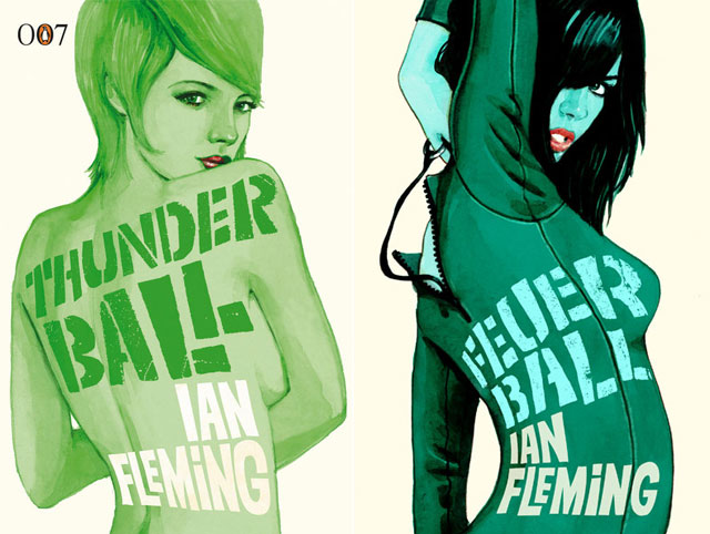
I saw an interesting post this morning from Michael GIllette. Gillette is a very talented commercial illustrator who was responsible for the painted Bond girls on the last run of James Bond books, published by Penguin Books. He published on his blog, the reworked version of one of the covers, Thunderball (he did 15 painted covers for the Ian Fleming novels and short stories). He says:

"Revisiting them allowed me to redo the Thunderball cover which printed disappointingly for Penguin (there were no time for print proofs)Green is the hardest colour to reproduce so it took a rethink on the approach."

I've posted the old on the left and the new on the right below.

Feuerball

Penguin, I assume, are using modern printing presses, but still there are frailties in reproducing certain colours in the spectrum, using traditional cyan, magenta, yellow and black inks. It is nearly impossible to achieve rich greens and oranges.

When you're in a situation, like above, where there won't be any printed proofs, it might be an idea to pump the colours with additional cyan for the greens (which was done in the new image above) or extra magenta for oranges, just to be sure. This will tip the colour balance towards the additive colour, but, if you're looking for richness, there is no alternative (aside from using a five or six colour printing process, which can be super expensive).

I have to say though, the new cover is far superior to the original- not just the colours, but the image and composition. Really ties in with the story and looks amazing.

Also, Feuer Ball? You can't help but love German.

Article postscript on Wednesday, 29th August 2012

I just remembered that this is not the first time Michael Gillette's artwork has featured on my blog- check this out.

⇠ Newer Articles Older Articles ⇢

Contents © 2008 - 2024 John Rainsford. All rights reserved. Hosted by Blacknight.