I like reading about other people’s web design processes, so I thought I’d detail my own process, from paper to pixels.
At the moment there is a lot of different processes being used for web design- some people like to create the design in Photoshop first, then chop it up and code it. Others work purely in HTML and CSS, to develop and refine their layouts.
My process encompasses four unique steps (that is, done separately to each other) and it may seem long winded, but it’s deliberately so. Between each refining step, I enjoy the breathing space to step back from a design or layout and consider additional improvements for the design.
I should mention that I usually show the client my ‘colour wireframes’ from Step 2, before proceeding. There’s usually enough detail at this stage to get approval on a design and layout. If the colour wireframe is not able to convey a certain design element (such as a textured pattern or a slideshow) I usually include links to similar elements on other websites.
Step 1: Paper and Pencil (or pen, or marker or burnt stick)
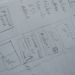 I find that paper sketches are the fastest way to quickly assemble and organise the different elements of a design. The freedom allows you to plan without technical constraints. I find that it’s also easier to make notes on paper sketches than a digital version. My sketches go from really basic to really detailed.
At this point, I must shamelessly plug my own sketch books, that I make and sell, called Copybooks. I made them as I wanted a small, economical sketch book, but I didn’t want them to be pocket-sized. I wanted a larger size sheet, for many smaller sketches and more detailed larger sketches. I have been using them for months and I find them just right for me and hopefully for others too. I go through many different layouts and ideas on quite a regular basis. As they're not pocket-books, they stay in relatively good condition and I shelve them once they're full. I can then work back through them if I want to revisit my notes, or take a photo of them for a blog post...
Step 2: Colour Wireframes
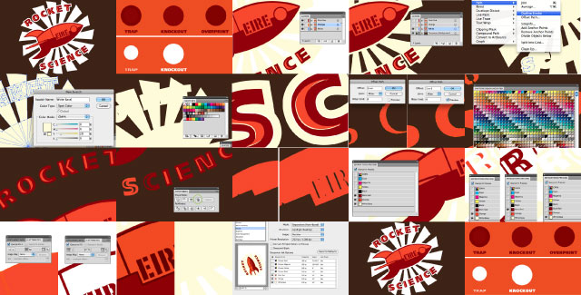
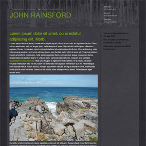
 Once I have an idea of my design layout down on paper, I move into Adobe Illustrator. Some may say this is overkill or misuse of Illustrator, but I use Illustrator because I’m familiar with it and I actually like using it. If you use a similar application, that’s cool too.
I find that it is quite easy to assemble a layout using boxes for different elements. At this stage I mostly work on proportions and colours, sticking to pixel dimensions and RGB colours. I use real logos and example photos- I can easily crop a photo to required size using clipping masks.
At this stage in a project, I usually view the design at 100% and screenshot the design. I then make a simple HTML file with the cropped layout design (as a JPG or PNG) centred on the page. It may be a static image but it really helps the client see how it will look when it’s in HTML and CSS. I usually get the nod to continue working on the design at this point (or go back and work on changes to the layout), which is when I move on to the next step.
As I was just about to publish this, Smashing Magazine posted a new article about using Illustrator for Productive Web Design. It's a great article and I picked up a few tips myself, check it out if you'd like to use Illustrator in your web design process.
Step 3: HTML/CSS
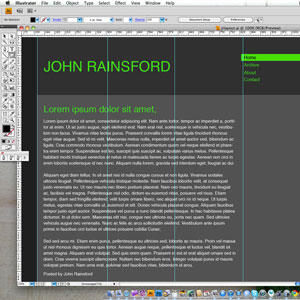
 Having the layout approved means that I don’t have to be too worried about the time it takes to produce the HTML and CSS. It will take as long as it takes. I prefer to set up a good foundation of code for a design than rush through it, which usually happens when you have that fear that it’ll be immediately rejected or some fundamental change will have to be made. Those changes always suck.
At this stage I use XScope a lot (check it out, a must for any web designer). It allows me to quickly find element dimensions and swatch colours from my colour wireframes from Step 2 (because I used proper pixel dimensions and RGB colours, of course). I actually prefer to swatch colours using XScope’s magnifying glass, as it gives me the values for the colour I see onscreen. As strange and paranoid as this sounds, I’ve used the RGB values from Illustrator’s colour palette and the colours produced in the web browser were not what I saw in my Illustrator designs, but I digress.
Once I have HTML and CSS, I can either show the client a simple HTML file or I can incorporate the design into the CMS that is being used and show them a ‘development’ site usually on a locked subdomain. It’s a lot more convenient to make small refinements at this stage.
Step 4: Details, details
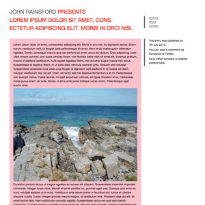
 Once I have a working development site, I usually refine the design a lot, taking either final content or dummy content into consideration. Styling text and spacing is easier with content.
At this stage I also like to add subtle elements to the design- a texture or a shadow to an element. I find it really adds depth to the design with a few textures. I have a collection of repeating textures that I have bought from istockphotos.com or more recently from SeamlessTextures.net. I also make my own textures (Seamless Textures also have a great tutorial for this here).
I find it easier to assign textures via CSS than at an earlier stage in the process- Once the texture or shadow or similar is in place, at least I can made edits and changes in Photoshop and simply refresh the HTML to see the changes in 'real life'.
With the advent of CSS3 features like box-shadows and RGBA hijinks, my time in Photoshop will be reduced, but it will always be necessary for textures.
Et tu?
Granted, I sometimes deviate from this process, but most of the time this is my modus operandi. I am a great believer in using the right tool for the right job, unfortunately I have to use 3 different digital applications, instead of the, much talked about, one.
As I said before, I’m always interested in other people’s processes, so if you have any cool additional steps in your process or if you have any queries about my process, let me know.
 I had planned to move the Book blog from Posterous to this website over Christmas, but I never got round to it. I have since accumulated a backlog of book reviews to catch up on. The purpose of the book blog is so I can keep track of what I've read, more for my own purposes than anything else. Posterous is a decent service, but it is more suited for people sending stuff via email, to be posted automatically- I just log in and update via the web. I still hope to add a review section to this site, then I'll have the fun of transporting 30+ book reviews over, but at least it'll be a lot less work to post reviews to it.