Previous Articles

As Gaeilge This article was posted on Thursday, 2nd December 2010

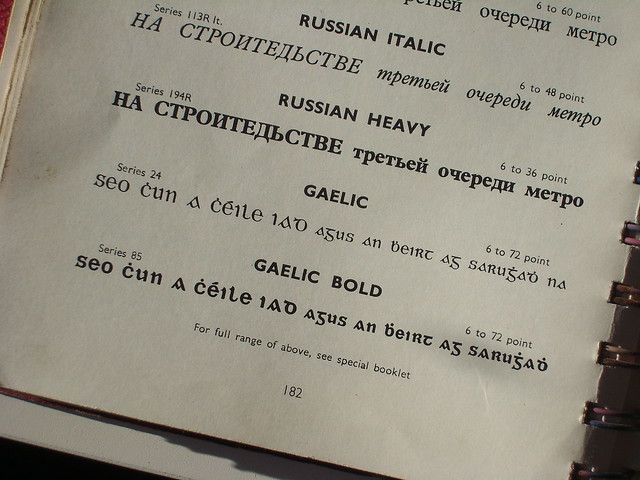
As I may have mentioned previously, my formal college education is related to the print industry and even though my work is all web design nowadays I still have a keen interest in print. I collect odd printed material and I have a collection of Irish books which were typeset in the same 'Gaelic' typeface designed for the Gaelic (Irish) language (Link to Wikipedia page on Irish type- a great resource for information relating to Irish type). I do not know who designed it but I do know that the Monotype foundry published it. I have an old Riscatype typeface catalogue from the 1950s which has a sample of the typeface, seen below, alongside some Russian Cyrillic text.

Page from Riscatype catalogue showing Gaelic typeface

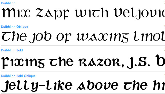
The typeface was cut as ‘Gaelic’ Monotype Series 24 A, created in 1906. Monotype Imaging’s website has a note for 1903 “First Irish font cut as Gaelic, Series 24.” A digital version was created in 1993 by Michael Everson and was titled ‘Duibhlinn’. Duibhlinn can be seen here on myfonts.com.

The form of the characters is similar to the uncial script seen in manuscripts such as the Book of Kells- the influence is there. In my opinion though, it looks like the original 1903 script was modelled on a piece of Irish text, and when it came to fulfilling the entire 26 character alphabet (the Irish language doesn’t use letters such as j, k, w, x, y, z), the designer simply mangled other characters to fill in the missing gaps. It reminds me of Jurassic Park where they put frog DNA into a dinosaur DNA strand, it works to a degree but then things go horribly wrong. In this case, the letter shapes don’t start breeding amongst themselves, but they do produce some horrific disjointed aesthetics.

Sample of Duibhlinn

I would love to, at some point in the future, develop a proper Irish typeface, using the classic Gaelic character shapes, but with more aesthetically pleasing proportions and better character interaction.

In a former life, I created a couple of Irish script typefaces, based on the characters from the Book of Durrow, but they were thick uncial characters, best suited for display work. I want to create an actual body-copy typeface, a Gaelic-Times-New-Roman. I think there would be a market for it, allowing for an Irish theme without it affecting legibility. Linotype have a good contender but their uppercase characters are a bit goofy.

I guess I’ll just add ‘New Gaelic Typeface’ to my ever growing to-do list. If you have any further information or suggestions for good Gaelic typefaces, please let me know and I'll post a follow-up.

Copybooks This article was posted on Wednesday, 3rd November 2010

Gridded CopybookIn school, when we progressed beyond the workbooks with the cute graphics, we moved on to writing and doing maths in copybooks, or as we called them, copies.

Throughout my school career I doodled endlessly. At several stages I had an extra copybook for my creations. I liked the aspect of keeping a book of work, rather than a handful of pages. My only issue was the pale blue horizontal lines on the pages (somehow maths copies were a bit better, simply because they had a grid rather than lines).

Fast forward twenty years and I’m still doodling endlessly, but rather than strange creatures, helicopters and rockets, it’s layouts, logos and the occasional rocket. I sketch out business proposals, to-do lists and blog posts. It’s that step before digitisation, it’s easier to refine stuff on paper than re-typing a task list.

I’ve tried lots of different types of notebooks, Moleskins, Field Notes, reporter-style, hard-back notebooks, soft-back notebooks etcetera. I’ve never been happy with any of them. Too big, too small, too heavy, too expensive. Being in and out of Data Print, with their battery of print and finishing equipment has allowed me to experiment with different sizes, page numbers and binding methods, to find just the right combination.

Initially I had perfect-bound the books, like a paperback novel, but this proved to be awkward, especially when flattening the pages out to write on them, so I saddle-stitched them with three staples. As it turns out, one of the resultant notebooks, measuring 146mm x 206mm, reminded me of the copybooks we used in school, and it was this form that I found most useful and useable.

I prefer blank pages rather than lines or grid, but I found that there wasn’t much additional cost in getting grid paper printed so I produced a quantity of grid paper and printed an alternative cover colour, to make it easier to distinguish between blank (black) and gridded (green) books.

Back cover detail
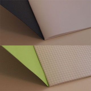
For extra fun, I printed the covers in an opaque silver ink (don’t worry, it’s a soy-based ink) with the image used on the masthead for this site. I think it provides an interesting texture to the book. I also put a little Bleed Edge leaf on the front and thebleededge.com url on the back. I didn’t want to over-brand the notebooks, it’s not my style, I prefer subtlety.

I am selling them over on thebleededge.com and they are sold separately. I have to send them via the more expensive registered post, as I had trouble with stuff getting lost on a previous venture. I will also throw in any extra stickers and stuff that I have lying around, into each order, to try compensate for the expensive postage. It’ll be great.

I am funding and producing these notebooks myself, so every product has a limited quantity. I hope to produce other variations in the coming months, different cover colours/images.

If I’ve left out any pertinent information, be sure to let me know and I’ll post a follow up.

The Bleed Edge This article was posted on Monday, 18th October 2010

When I left my last employment position on 31st December 2007, one aspect of my new found freedom that I wanted to pursue, was to start blogging. I was already creating screen printed prints for exhibitions and for my own amusement. I wanted to write up the process- I was influenced by the Army of Cats process blog- so I began formulating a plan.

At the time, in early 2008, I was learning Ruby on Rails, and I decided to use a blog as a project to help with my learning. I agonised over the name- I wanted something print-related but still fairly abstract. Early contenders were 3mm Bleed (no domain, my dislike of numbers in domains) and The Bleed (too gruesome). I settled on a term that is not often used, The Bleed Edge. The description of what the bleed edge was, I thought was very apt- its the edge of the substrate where nothing important should be put, as it’s liable to get the chop when the prints are trimmed down.

Deploy, deploy

I got my blog launched and had a number of entries, but keeping a Rails app was proving more hassle than I wanted- I was using a shared Rails hosting environment and it kept updating Rails and breaking my blog, so I abandoned it, planning on opening a Wordpress blog or Blogger blog, to replace it. As it happened, I did reopen a blog but just kept it under my own name. I ported across the blog posts and they can be seen on the Wordpress v1 of this site.

When I was planning on the revamp of this site, I decided to use my own PHP CMS for the blogging engine and one aspect that I wanted to introduce was a shop- I still had screen prints and other stuff that I wanted to sell. I began working on it separately to the blog- I knew it’d take me longer to develop and I was going to keep it on a separate subdomain to the blog, something like shop.johnrainsford.com.

Genesis, without Phil Collins

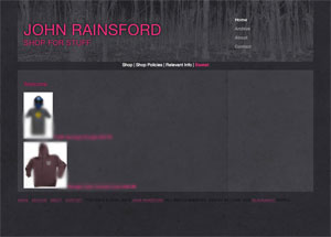
The genesis of the shop utilised the basic design on this site but I chose an electric pink instead of the green- I don’t often get to use pink so I was definitely taking this opportunity! Half way through the project, I launched the revamped version of this blog, so I took stock of progress on the shop, and realised that if I left it as an add-on of this site, I’d be limited, in terms of branding, and products I could sell. For example, I am planning on selling products, like tshirts, for my company Pixelcode, and I would prefer to sell them from a dedicated shop rather than an add-on to another site (why wouldn’t I add on a shop to the Pixelcode website as well etc). So I resurrected the domain thebleededge.com and incorporated the name into the design.

By design

I kept the same dimensions for the design as this site, changing the textures and the main navigation to run horizontally. I like these proportions and they add a certain amount of similarity between this site and thebleededge.com. I created an updated version of my PayPal integration scripts, which allows for better interaction between the site and PayPal. I also created a better shipping script, which I may go into detail on a later blog post. Basically my issue was having products like screen prints, which ship in tubes, and products that ship in envelopes. The products that ship in envelopes will not fit in tubes and vice versa.

On other shopping carts, the postage is worked out by weight, so I developed a way of distinguishing the shipping method, for each product, so if someone orders a product that’ll ship in a tube and one that ships in an envelope, they get charged an appropriate shipping fee for both. The shipping works out a bit more expensive if this situation arises, but it’s preferable to trying to ship the two together, which wouldn’t work.
I still have tweaks and fixes to make to both the design and development, but it’s quite sound. It actually works like a charm, so far.

You can check it out now, and if you want to keep informed of updates, follow @thebleededge Twitter account. I have a cool new product launching this week as well, which I will be writing it up here too- I’m very excited about them and I have been using them for a while and I find them really useful. As always, if you have any comments or queries, just let me know.

Re: Cognition This article was posted on Monday, 11th October 2010

Happy Cog launched their company blog, Cognition, last Thursday. As well as a nice, slick design, they’ve removed traditional inline comments- the site allows you to tweet your comments directly to your Twitter account or insert a link to a response on your own blog.

They have over 330 comments so far, the vast majority from Twitter and they range from being congratulatory, for the new-ish approach to comments by using Twitter (including their real nice implementation), to condemnation- 140 characters is quite limiting, didn’t you know?

There has been very little said on the option to post a link to your own relevant blog post, which in my humble opinion, is a real brave, positive step for blogs and the web as a whole. It is the one feature I really have to applaud those smart people at Happy Cog for doing- I feel it should be celebrated a lot more than Twitter commenting.

Boldly going...

I think the new comment system is a brave step forward simply because the value of original, long-form written content seems to be forgotten in recent years. You visit people’s websites and all they have is links to a random bunch of social network profiles, Twitter pages and Flickr pages. You might also get their travel plans too.

I’m not saying that these have no value, but when they exist on their own, they’re pretty lonely. I see some of my favourite blogs as the glue that binds their author’s online (and possibly real) life together. I don’t mind seeing where they are travelling to or looking at their photos or reading their tweets, because through their blog, I have gotten to know them so much more than if I had just visited their social network profiles- social networks compliment blogs and vice versa.

Positive encouragement

I think the Cognition blog is also a positive move forward, as it not only recognises the value of traditional blog posts, it also actively encourages people to write a response or add to the discussion created on the Cognition blog.

If a topic came up on the Cognition blog, one that I was passionate about and I felt that I needed to add my voice to the discussion, I wouldn’t use Twitter. I would sit down and write a blog post, adding my two cents to the discussion and possibly furthering the discussion.

If they had traditional inline comments, I’d feel half-obliged to post my thoughts there- more than likely discouraging me completely or at the very least, inhibiting my opinion (posting an opinion, either agreeing or disagreeing, can be daunting, especially on someone else’s website.) Then there’s the possibility that when the blog migrates to a newer CMS or shuts down, your comment/thought/opinion will be lost forever. With this new way of promoting a discussion, everyone becomes responsible for their own piece, their own opinion.

There have been a number of blog authors who have no comments on their blog and would encourage others to write blog posts in response to the original blog post, rather than comment on the original blog post- Jeremy Keith has been quite vocal on his blog in relation to comments.

Get it?

I think that Happy Cog have really shown a deep understanding of the web and what is good for the web. This isn’t a smooth marketing gimmick for them to flex their creative muscles- it’s a genuine effort to educate web professionals and to promote an active discussion over topics important to our industry. The beauty is that it is not a discussion just on their patch of the web, it spreads right across the web.

As it should.

Waste This article was posted on Friday, 8th October 2010

Golden Pages 

Dumped outside my front door this morning was the latest GoldenPages from Truvo. I think the last time I looked at a GoldenPages was in the late nineties. Why do Truvo and Eircom continue to print and distribute these books? A Google search is only a few key-presses away.

I guess if they weren't printing and distributing as many, they couldn't charge their advertisers as much. I would say that if at least 1% of the people who got their copy of the phone book took it out of the cellophane, let alone read it, it'd be a minor miracle. I wouldn't take an advertisement out in the GoldenPages- it'd just show how out-of-touch I was, not just with modern advertising, but the modern world.

It's a waste, for everyone involved. It's a waste for advertisers, it's a waste of resources such as paper, it's a waste of my time trying to figure out how to stop them from sending them to me and where I can recycle it, to stop it taking up space in my home.

⇠ Newer Articles Older Articles ⇢

Contents © 2008 - 2024 John Rainsford. All rights reserved. Hosted by Blacknight.