Previous Articles

Rebranding Pixelcode: Promoting Completion This article was posted on Friday, 1st April 2011

As I said in my last post, there is a few loose ends that I want to cover, before I feel that I have completed this topic for good. Creating a new logo is an act in itself, but branding also involves the process of putting your logo on all relevant material and products.

I’m only halfway through branding stuff so far- I’m working on the new Pixelcode website first- I want to work out all design issues on the website before I start branding printed stationery and promotional items. As a web design company, I’d prefer to base all company branding on the company website, rather than design letterheads and business cards and then try to tie the website along with these.

Due to the fact that I don’t have anything to show yet, I thought I’d expand on the list of things I wanted to brand, which I compiled before beginning this project. Hopefully it’ll be of some use to someone about to embark on this tortuous and rewarding exercise.

I have split the items into three lots, the most important and necessary (in my opinion) are first and the level of necessity drops to the ‘great to have but I can run my business without them’ level for the third lot.

Level 1- Stationery or ‘Professional Business Accoutrements'

Screen Printing Pixelcode

Letterheads- Gone is the necessity to get a load of letterheads printed- I think most correspondence is done through email nowadays. However, even though I email all my documents as PDFs, I still need a letterhead for invoices, project estimates and cover notes, regardless of the medium.

I may do a tutorial in the future about designing letterheads- there are certain age-old design rules that, when followed, will make your letterheads looks so much better. I will also detail the potential hazards with using your letterhead as a template in your documents. It can be a nightmare job to get your invoicing app to play nice with your letterhead.

Business Cards- If you are out networking with people (always good for business) you will need business cards. In actual fact, if you are in business at all, you should have business cards. Sure your details are online, but a business card is not just an information carrier, it’s a reminder for people to look at your website or to get back in touch.

There are lots of business card design tutorials out there (more so than letterheads) and it’s worth bearing in mind that if you avail of one of those cheap-o business card printing services, that it’ll only reflect poorly on your business. If your card is uninspiring, it is not going to encourage further communication from potential clients.

Compliment Slips- Convenient for including with documents, compliment slips are usually one-third the height of your letterheads and are often simply letterheads with the bottom two-thirds guillotined off. Compliment slips are only of use when printed (you wouldn’t email a compliment slip with personal note written on it, would you?) and with digital printing, you could get a small batch printed. Consider doing an upright slip, for more writing space. Remember, the size of a compliment slip should always be similar to dimensions of a business envelope. If you have to fold it in anyway, it becomes inconvenient.

Envelopes- As with printed letterheads, the days of using enough envelopes to justify a printed run are becoming less and less. Unless you’re doing some sort of mail-shot, forget about printed envelopes, and focus more on stickers for your envelopes. There’s so many ways you could design functional stickers for envelopes, I’ll probably end up doing a separate post on the topic, I love designing stickers.

Level 2- Occasional Promotional items or ‘Additional Accoutrements’

Stickers!

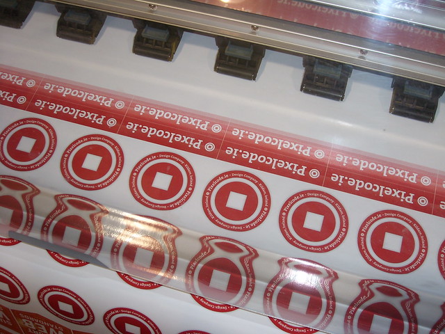
Stickers- One of my favourite promotional items. they’re always a nice item to give away, but also the easiest way to brand everything you send out, especially envelopes (see above). With new digital solvent printing, you can have small amounts of full-colour vinyl stickers with a custom shape at a very economical price. Consider doing stickers that can either double as return address labels or else get two lots done.

Calendars- They walk the fine line between functionality and aesthetics. I like calendars because you have a lot of freedom to produce something visually pleasing, with a functionality that requires the calendar be kept for a year.

You don’t need to produce a 12 page, wire bound publication, a simple single panel with a nice calendar and image can be just as appealing. Look for a good printer who will round-corner it and punch a single hole at the top for hanging and you can have a nice, inexpensive promotional item.

Greeting Cards- Sometimes I think greeting cards can be more of a nuisance than a benefit, but when I don’t have to think about sending out 50 greeting cards at Christmas, I think they’re a nice thought and more personal than a Christmas greeting email.

You could always go the route of a more generic greeting card and use them throughout the year, think ‘Best Wishes’ rather than ‘Merry Christmas’.

Level 3- Fun Promotional items or ‘Silent Marketing Tools’

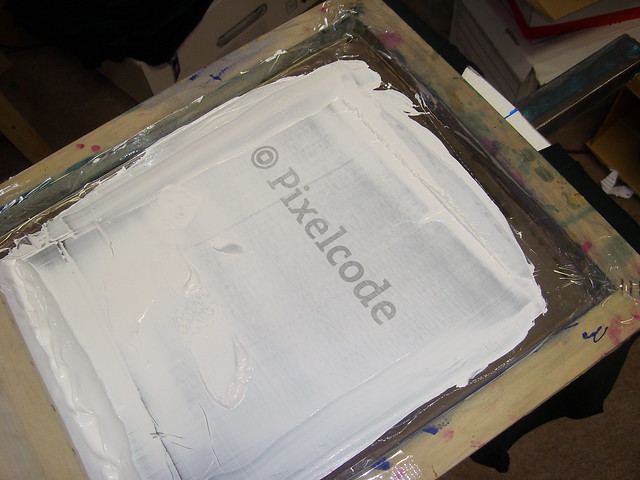
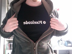
T-shirts- combining functionality with brand marketing, t-shirts are great to have. There are some decent tutorials out there, some written by dubious sources, but the real considerations you have to bear in mind are cost, storage and getting rid of them.

Pixelcode T-ShirtIf you’re getting t-shirts printed, screen printing is usually only economical on runs of 50+, which means (cost of shirt * 50) + (cost print * 50) + (cost of set-up).

Then you take delivery of 50 t-shirts that have to be stored in an aired location, away from damaging elements like odours, moisture and possible staining agents.

Then you have to come up with some method of either giving them away or selling them. Sure, everyone has friends that’d love a free t-shirt but if you had t-shirts made to benefit your business, there are only two ways they can do this- impress potential clients/business partners or through selling them.

The first option’s success depends on the person or business you’re trying to impress, but the second option could bring back some cash and profit for your business and possibly open a new line of revenue, if your t-shirts are popular.

Badges- Badges or Buttons as our US cousins call them fall into the same area as stickers, just without the functionality that stickers can have. They’re relatively cheap to get made and can be a cheap, tangible promotional item which you can give to people. I use Modern City in France for badge making, I found their service and prices excellent.

Mugs- These are quite similar in essence to t-shirts. You’ll have to get a large quantity printed, but storage should be easier. If I had the budget for only mugs or t-shirts, I think I’d choose mugs. One size fits all and not only will everyone use them, they’ll probably use them everyday and be constantly looking at your brand and contact details. You can also flog them on your website- who doesn’t love a nice mug?

You can go your own way

The above are just some suggestions, I’m not sure if I’ll get around to doing every item in the three lists but I’ll make a good stab at them over the next year or so.

What you should always consider, when deciding on getting custom branded promotional stuff, is the cost involved in producing the item and what you will get back from it. Of course tangible return is always the best but sometimes the intangible promotion, marketing and good vibes you get from a nice promotional piece is worth it on it’s own.

I hope I have provided some food for thought, this is the final piece in the ‘Rebranding Pixelcode’ exercise. In the process of branding some of the above, I hope to produce a couple of tutorials, to provide help and ideas for your own business stationery and promotional items.

If I’ve missed anything or if you have any queries, please contact me and I’ll do my best to help. 

Article postscript on Friday, 1st April 2011

This is part of a four-part Rebranding Pixelcode series. It consists of 1. A preamble, 2. Research, 3. Three Ideas and 4. Promoting Completion.

Forty Shades of Green This article was posted on Thursday, 17th March 2011

It may be a cliché, but for me, one of the most unique things about Ireland is the shade of green which typifies the Irish landscape. You can always tell a photo taken within Ireland, simply by the shade of green in the photo- you never seen anything like it elsewhere.

Daffodils and GrassIt probably has to do with the large amounts of Lime in the soil and the Limestone bedrock we’re sitting on. It is probably the large amount of rain we get year-round. It’s also probably the history of forestry on the island that has been fertilising our soil and forming our bogs for thousands of years.

Some years we have less rain during the summer months and everything takes a slightly yellowed hue, but then other years we get a good summer where weeks of bright hot sunshine are interspersed with blasts of rain. This is when you get the greenest of greens.

St. Patrick’s Day is celebrated worldwide and as an Irish person, that’s nice to know. With our recent economic meltdown, a large amount of Irish have had to become emigrants again. Every bit of friendliness worldwide will be appreciated by our largest export.

Rebranding Pixelcode: Three Ideas This article was posted on Tuesday, 15th March 2011

This is the third instalment of the branding exercise I did for my own company, Pixelcode. After making the decision to create a new brand and then doing some research I now had to get down to work and actually create the logos and logotype.

Ideas from copybook

I had several different ideas in my copybook for potential logos, but as I began sketching out ideas for implementation (like how it would look on a website) I always seemed to gravitate towards an idea that stemmed from an infinity loop. I love the infinity loop and it’s three dimensional cousin, the möbius strip, but this idea began to morph into a stylised P.

Stylised P- Idea 1

This eclipsed any other ideas I had and I took a real shine to it. Unfortunately after a ‘honeymoon’ period of using it in dummy layouts and situations, I realised that this logo still didn’t provide a solution to the problems I was having. It still used a letter rather than an icon, image or shape. It also had a lot of issues when paired with the company name- run it alongside the logo it looked like PPixelcode. When it was paired with non-italic text, it looked out of place and unbalanced. The list went on- in this form it just wasn’t working for me.

Separation Anxiety

I was still enamoured with the shape, so I tried a different approach. I decided to make a logotype out of the icon. After a few printouts and printed guidelines, I scripted the rest of the letters in a similar style to the P, producing a script-like logotype:

Traced Script Logo

It was at this point that my love affair with the P shape was deteriorating pretty rapidly. Not only was a logotype less flexible than a logo icon, I just knew in my gut that it didn’t suit my business and the style of work we produce. It was at this point that I decided to scrap the P and the logotype completely. I was getting caught up with it and it was clouding my objectivity.

Back to basics

Images of third idea in copybook
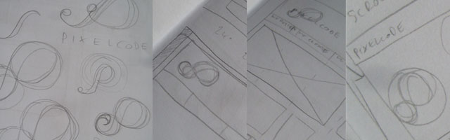
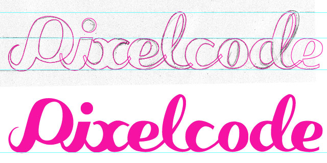
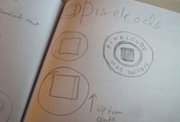
I went back to my copybook and decided to work on ideas that were much simpler. I thought about how my company, Pixelcode, would be represented in icon form. It then occurred to me that the simplest shape is a square, representing a pixel. I sketched up a few ideas, but I knew variations would be easier done in Illustrator.

After a little tweaking and several versions in Illustrator, I eventually had a shape that I liked and a shape that I thought would work. I added in a ring within the circular shape, just so it’s not so heavy in colour. It also reminded me of a bullseye, which was nice. I liked it immediately which is usually a good start.

Variations of the round logo

Halfway there

Once I had a logo shape, I needed a typeface to pair with it. Having (over)used Helvetica previously, I wanted something that wasn’t so common and I was definitely open to a seriffed font. I tried a couple of different ‘faces, until I stumbled across a typeface that I have had since pre-OSX, a typeface originally sold by FontFont but now appears to be owned by FontShop. The typeface is called ‘The Serif’.

I have had this font for so long, I can’t remember why I got it in the first place. I will probably have to re-buy it, as the version I have has no Euro symbols, but at least I’ll get a couple of nice new OpenType fonts instead of the tatty TrueType fonts I currently own. A bit of fiddling and resizing and I finally had the combination I was looking for.

Magnetic Board with Logo ideas on it
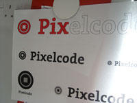
As with the previous two designs, I printed out some samples and stuck up on my wall. If you have the time to do it, simply living with the logo, seeing it every day for a few weeks is a good test to see whether it’ll work for you, both aesthetically and functionally.

As it turned out, the more I saw it, the more I liked it. I started to think of all the different ways I could use it on different stuff. I also put together some different examples of colour combinations and logo placements. There was just so many possibilities that I couldn't wait to get working with it.

The last instalment of this particular story, will be on all the loose ends that will need to be tied up. At this point I haven't implemented the logo anywhere yet, as I'm working on a new Pixelcode website. Once that is finished, I'll be rolling out the new brand on the main website, social networks and stationery all at once. I think the next instalment will be mostly be a checklist of work to do and how it will be done. 

Article postscript on Friday, 1st April 2011

This is part of a four-part Rebranding Pixelcode series. It consists of 1. A preamble, 2. Research, 3. Three Ideas and 4. Promoting Completion.

Rebranding Pixelcode: Research This article was posted on Thursday, 3rd March 2011

This is the second part in my ‘Rebranding Pixelcode’ series, the first part can be seen here. In this part I’m going to concentrate on the “research” I did before and during the process of putting together logo ideas. I say “research” rather than research simply because I subscribe to a lot of blogs, magazines and twitter feeds where examples of logo design and branding are constantly being shared. It’s constant idea-osmosis.

Look and Feel

In the previous instalment, I wrote about what I wanted from the logo, so the main purpose of this research was to get a feel for logo shape and it’s relationship to the company name. (I should mention at this point that, even though I keep referring to a ‘logo’, I hadn’t actually ruled out a ‘logotype’. I just use logo for the sake of brevity.)

I was sure the form of the logo would come as soon as I started developing it in Illustrator, so I was more interested in the “look and feel” rather than anything more definite. I kept notes in my notebook throughout- sketching shapes and noting ideas is a great way to build up a repository of ideas, crucial when the time comes to actually create a logo.

Sources of Inspiration

Below are the main sources of inspiration that I turned to in my research phase. Wherever possible, I tried to find examples of how the logo and branding was used on web and print material- sometimes a logo can seem quite plain and ordinary but when it’s implemented on promotional material, the versatility of the logo shines through.

Books and Magazines

Some inspirational books

I own a good few design and logo books, my favourite being Los Logos and Dos Logos, they’re great to flick through for some logo inspiration. I also have a stack of Computer Arts Project magazines which have some great brand identity tutorials.

Websites

There are loads of branding and logo design websites, but two of my favourites are from the same people, Brand New and For Print Only (FPO). They consistently produce excellent articles and should be included in everyone’s RSS feeds.

My latest hang-out spot is Dribbble- I don’t have a membership but I do peruse people’s posts, they can be quite inspiring at times. Although most of the designs are cropped, they can give you ideas based on the piece shown.

Your peers

I looked at many web design companies and I noticed many trends which I avoided (not to be deliberately different, it’s just that some of the latest trends are not what I would favour). The most important stuff that I took from looking at my industry peers is their use of logos on their website and related online presence.

For example, how does a company represent themselves on their main business website, their favicon, their Twitter avatar, on their Client/Project management website, sponsorship badges on other websites, how they credit themselves on websites that they have created, and so on.

Conclusions

It was clear from my research that the old rules of branding and logo design still exist for branding on the web. The real good logos survived at being displayed big and really small (favicon small) and regardless of the colour scheme used, the logo was still recognisable and unique.

What I also gleamed from my research was that I had two choices- I could go the very radical route and use the limitless colours and rendering capability of a computer monitor to create a very contemporary logo, knowing that I’ll be tweaking it endlessly and probably redoing it after a short period, or I could try create a robust design that would hopefully last a long time and could be adapted to many different mediums.

Yes, you guessed it, I chose the latter option. I’d hate to be limited to the computer screen- I’m the son of a print designer.

After I had done enough research that I felt inspired and motivated to begin doing something definite, I began refining sketches and put the kettle on and stoked up Adobe Illustrator. The real work begins now and I’ll be detailing it in the next instalment, coming soon. 

Article postscript on Friday, 1st April 2011

This is part of a four-part Rebranding Pixelcode series. It consists of 1. A preamble, 2. Research, 3. Three Ideas and 4. Promoting Completion.

Rebranding Pixelcode: A preamble This article was posted on Tuesday, 1st March 2011

This is the first in a number of blog posts relating to the exercise I undertook at the end of 2010, to rebrand my web design company Pixelcode. It was supposed to be a single post but after writing the introduction, shown below, I decided to split it up into several pieces. Please subscribe or follow me on Twitter to be kept informed of when the next instalment is posted.

Why Pixelcode?

My old rainsford1.com logo- notice anything about the red background image? looks familiar eh? 
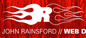
When my then-girlfriend, now-wife, joined me in the freelancing world in January 2009, I made the decision to work under a company name, rather than just my own name. I was trading as John Rainsford Design and operated from the woeful domain rainsford1.com. If you’ve ever had a domain with a numerical figure in it, you can understand the pain of trying to explain to someone on the ‘phone that my website is not ‘rainsfordone.com’ but rather ‘rainsford-figure-one.com’ but not ‘rainsfordfigure1.com’ etcetera. 

The path to where we are

We made this decision to register a company name in January, but it took until February to come up with a name and then until March to produce a website. We chose ‘Pixelcode’ as it related to what we did and was a combination of two words, which formed a new word, which didn’t really mean anything. That was fine by us, we just needed a name to promote our business with.

The whole process took far too long and as a result, when it came to branding the new company, we had very limited time to produce a logo, a website, business cards, letterheads and brochures.

We toyed with a few ideas but settled on a pixelated P, shown below, with the pixels spaced out. Later the spaced out pixels caused problems on many levels- the deal-breaker happened when it was scaled down- it became a mush, so we combined the pixels to form a solid P, as shown on the right.

A year into using the logo, we knew we needed a new logo- it was evident that we hadn’t put the appropriate amount of thought and testing into the logo- making the minor change with spacing the ‘pixels’ helped, but still, it was a difficult logo to work with- there wasn’t much scope to adapt it to different mediums easily.

Achievements

Old Stationery
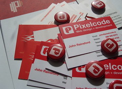
With a new logo, we wanted flexibility in the one key area: branding of stuff. Whether it's our website, business stationery, clothing or anything else we can stick our logo on, we wanted a universal symbol that works on all substrates with equal success.

We found that the asymmetrical P was oftentimes difficult to get it to ‘look right’ when positioning it. If you positioned it centrally, it looked ‘off’ and you could only align it to the left because it looked strange being right-aligned.

Another area which was a nuisance was the straight sides of the P- it had too many corners. This was fine under conventional printing but we’re fond of screenprinting and oftentimes dead-straight edges and many 90-degree angles will not work with screen printing to any great success. All it needs is a slight warp in a screen or a flexible surface and our pixellated P looks ‘off’ again.

P-P-Pick up a Pixelcode logoAnother area where our old logo tormented us, was the actual form of the logo- it’s a text character P. Oftentimes it was paired with the name ‘Pixelcode’ so for all intents and purposes, it was ‘PPixelcode’.

As you’ll see in further instalments, this mistake was nearly made again, but in testing, we realised that a logo with a simple shape was needed.

Potential options

We’re in the business of design, so it is an important aspect of everything that we do. But in theory, we could have stuck Helvetica 24pt on everything and that could be our brand and it probably wouldn’t affect our business. This would be great if I was a business manager and not a designer but, as every designer knows, branding and designing logos and logotypes is one of the most rewarding and enjoyable design exercises (it's also the most frustrating, difficult, time consuming and stressful exercises) any designer can do. I don’t think there is a designer out there who would pass up the opportunity to design a brand, especially for themselves.

As I said at the start, I had planned on doing this whole process as a single blog post but I think it would be a mammoth post and too long. I'm splitting it up into as many pieces as I have to and the next part is on the research I did for the logo.

Article postscript on Friday, 1st April 2011

This is part of a four-part Rebranding Pixelcode series. It consists of 1. A preamble, 2. Research, 3. Three Ideas and 4. Promoting Completion.

⇠ Newer Articles Older Articles ⇢

Contents © 2008 - 2024 John Rainsford. All rights reserved. Hosted by Blacknight.