This is the third instalment of the branding exercise I did for my own company, Pixelcode. After making the decision to create a new brand and then doing some research I now had to get down to work and actually create the logos and logotype.
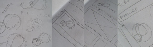
I had several different ideas in my copybook for potential logos, but as I began sketching out ideas for implementation (like how it would look on a website) I always seemed to gravitate towards an idea that stemmed from an infinity loop. I love the infinity loop and it’s three dimensional cousin, the möbius strip, but this idea began to morph into a stylised P.

This eclipsed any other ideas I had and I took a real shine to it. Unfortunately after a ‘honeymoon’ period of using it in dummy layouts and situations, I realised that this logo still didn’t provide a solution to the problems I was having. It still used a letter rather than an icon, image or shape. It also had a lot of issues when paired with the company name- run it alongside the logo it looked like PPixelcode. When it was paired with non-italic text, it looked out of place and unbalanced. The list went on- in this form it just wasn’t working for me.
Separation Anxiety
I was still enamoured with the shape, so I tried a different approach. I decided to make a logotype out of the icon. After a few printouts and printed guidelines, I scripted the rest of the letters in a similar style to the P, producing a script-like logotype:
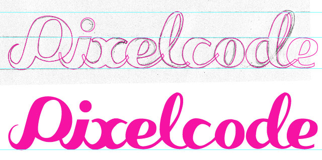
It was at this point that my love affair with the P shape was deteriorating pretty rapidly. Not only was a logotype less flexible than a logo icon, I just knew in my gut that it didn’t suit my business and the style of work we produce. It was at this point that I decided to scrap the P and the logotype completely. I was getting caught up with it and it was clouding my objectivity.
Back to basics
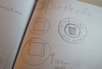 I went back to my copybook and decided to work on ideas that were much simpler. I thought about how my company, Pixelcode, would be represented in icon form. It then occurred to me that the simplest shape is a square, representing a pixel. I sketched up a few ideas, but I knew variations would be easier done in Illustrator.
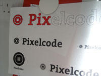
After a little tweaking and several versions in Illustrator, I eventually had a shape that I liked and a shape that I thought would work. I added in a ring within the circular shape, just so it’s not so heavy in colour. It also reminded me of a bullseye, which was nice. I liked it immediately which is usually a good start.

Halfway there
Once I had a logo shape, I needed a typeface to pair with it. Having (over)used Helvetica previously, I wanted something that wasn’t so common and I was definitely open to a seriffed font. I tried a couple of different ‘faces, until I stumbled across a typeface that I have had since pre-OSX, a typeface originally sold by FontFont but now appears to be owned by FontShop. The typeface is called ‘The Serif’.

I have had this font for so long, I can’t remember why I got it in the first place. I will probably have to re-buy it, as the version I have has no Euro symbols, but at least I’ll get a couple of nice new OpenType fonts instead of the tatty TrueType fonts I currently own. A bit of fiddling and resizing and I finally had the combination I was looking for.
 As with the previous two designs, I printed out some samples and stuck up on my wall. If you have the time to do it, simply living with the logo, seeing it every day for a few weeks is a good test to see whether it’ll work for you, both aesthetically and functionally.
As it turned out, the more I saw it, the more I liked it. I started to think of all the different ways I could use it on different stuff. I also put together some different examples of colour combinations and logo placements. There was just so many possibilities that I couldn't wait to get working with it.
The last instalment of this particular story, will be on all the loose ends that will need to be tied up. At this point I haven't implemented the logo anywhere yet, as I'm working on a new Pixelcode website. Once that is finished, I'll be rolling out the new brand on the main website, social networks and stationery all at once. I think the next instalment will be mostly be a checklist of work to do and how it will be done.