This is the first in a number of blog posts relating to the exercise I undertook at the end of 2010, to rebrand my web design company Pixelcode. It was supposed to be a single post but after writing the introduction, shown below, I decided to split it up into several pieces. Please subscribe or follow me on Twitter to be kept informed of when the next instalment is posted.
Why Pixelcode?
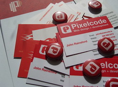
 When my then-girlfriend, now-wife, joined me in the freelancing world in January 2009, I made the decision to work under a company name, rather than just my own name. I was trading as John Rainsford Design and operated from the woeful domain rainsford1.com. If you’ve ever had a domain with a numerical figure in it, you can understand the pain of trying to explain to someone on the ‘phone that my website is not ‘rainsfordone.com’ but rather ‘rainsford-figure-one.com’ but not ‘rainsfordfigure1.com’ etcetera.
The path to where we are
We made this decision to register a company name in January, but it took until February to come up with a name and then until March to produce a website. We chose ‘Pixelcode’ as it related to what we did and was a combination of two words, which formed a new word, which didn’t really mean anything. That was fine by us, we just needed a name to promote our business with.
The whole process took far too long and as a result, when it came to branding the new company, we had very limited time to produce a logo, a website, business cards, letterheads and brochures.
We toyed with a few ideas but settled on a pixelated P, shown below, with the pixels spaced out. Later the spaced out pixels caused problems on many levels- the deal-breaker happened when it was scaled down- it became a mush, so we combined the pixels to form a solid P, as shown on the right.

A year into using the logo, we knew we needed a new logo- it was evident that we hadn’t put the appropriate amount of thought and testing into the logo- making the minor change with spacing the ‘pixels’ helped, but still, it was a difficult logo to work with- there wasn’t much scope to adapt it to different mediums easily.
Achievements
 With a new logo, we wanted flexibility in the one key area: branding of stuff. Whether it's our website, business stationery, clothing or anything else we can stick our logo on, we wanted a universal symbol that works on all substrates with equal success.
We found that the asymmetrical P was oftentimes difficult to get it to ‘look right’ when positioning it. If you positioned it centrally, it looked ‘off’ and you could only align it to the left because it looked strange being right-aligned.
Another area which was a nuisance was the straight sides of the P- it had too many corners. This was fine under conventional printing but we’re fond of screenprinting and oftentimes dead-straight edges and many 90-degree angles will not work with screen printing to any great success. All it needs is a slight warp in a screen or a flexible surface and our pixellated P looks ‘off’ again.
![]() Another area where our old logo tormented us, was the actual form of the logo- it’s a text character P. Oftentimes it was paired with the name ‘Pixelcode’ so for all intents and purposes, it was ‘PPixelcode’.
Another area where our old logo tormented us, was the actual form of the logo- it’s a text character P. Oftentimes it was paired with the name ‘Pixelcode’ so for all intents and purposes, it was ‘PPixelcode’.
As you’ll see in further instalments, this mistake was nearly made again, but in testing, we realised that a logo with a simple shape was needed.
Potential options
We’re in the business of design, so it is an important aspect of everything that we do. But in theory, we could have stuck Helvetica 24pt on everything and that could be our brand and it probably wouldn’t affect our business. This would be great if I was a business manager and not a designer but, as every designer knows, branding and designing logos and logotypes is one of the most rewarding and enjoyable design exercises (it's also the most frustrating, difficult, time consuming and stressful exercises) any designer can do. I don’t think there is a designer out there who would pass up the opportunity to design a brand, especially for themselves.
As I said at the start, I had planned on doing this whole process as a single blog post but I think it would be a mammoth post and too long. I'm splitting it up into as many pieces as I have to and the next part is on the research I did for the logo.