This is the second part in my ‘Rebranding Pixelcode’ series, the first part can be seen here. In this part I’m going to concentrate on the “research” I did before and during the process of putting together logo ideas. I say “research” rather than research simply because I subscribe to a lot of blogs, magazines and twitter feeds where examples of logo design and branding are constantly being shared. It’s constant idea-osmosis.
Look and Feel
In the previous instalment, I wrote about what I wanted from the logo, so the main purpose of this research was to get a feel for logo shape and it’s relationship to the company name. (I should mention at this point that, even though I keep referring to a ‘logo’, I hadn’t actually ruled out a ‘logotype’. I just use logo for the sake of brevity.)
I was sure the form of the logo would come as soon as I started developing it in Illustrator, so I was more interested in the “look and feel” rather than anything more definite. I kept notes in my notebook throughout- sketching shapes and noting ideas is a great way to build up a repository of ideas, crucial when the time comes to actually create a logo.
Sources of Inspiration
Below are the main sources of inspiration that I turned to in my research phase. Wherever possible, I tried to find examples of how the logo and branding was used on web and print material- sometimes a logo can seem quite plain and ordinary but when it’s implemented on promotional material, the versatility of the logo shines through.
Books and Magazines
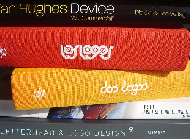
I own a good few design and logo books, my favourite being Los Logos and Dos Logos, they’re great to flick through for some logo inspiration. I also have a stack of Computer Arts Project magazines which have some great brand identity tutorials.
Websites
There are loads of branding and logo design websites, but two of my favourites are from the same people, Brand New and For Print Only (FPO). They consistently produce excellent articles and should be included in everyone’s RSS feeds.
My latest hang-out spot is Dribbble- I don’t have a membership but I do peruse people’s posts, they can be quite inspiring at times. Although most of the designs are cropped, they can give you ideas based on the piece shown.
Your peers
I looked at many web design companies and I noticed many trends which I avoided (not to be deliberately different, it’s just that some of the latest trends are not what I would favour). The most important stuff that I took from looking at my industry peers is their use of logos on their website and related online presence.
For example, how does a company represent themselves on their main business website, their favicon, their Twitter avatar, on their Client/Project management website, sponsorship badges on other websites, how they credit themselves on websites that they have created, and so on.
Conclusions
It was clear from my research that the old rules of branding and logo design still exist for branding on the web. The real good logos survived at being displayed big and really small (favicon small) and regardless of the colour scheme used, the logo was still recognisable and unique.
What I also gleamed from my research was that I had two choices- I could go the very radical route and use the limitless colours and rendering capability of a computer monitor to create a very contemporary logo, knowing that I’ll be tweaking it endlessly and probably redoing it after a short period, or I could try create a robust design that would hopefully last a long time and could be adapted to many different mediums.
Yes, you guessed it, I chose the latter option. I’d hate to be limited to the computer screen- I’m the son of a print designer.
After I had done enough research that I felt inspired and motivated to begin doing something definite, I began refining sketches and put the kettle on and stoked up Adobe Illustrator. The real work begins now and I’ll be detailing it in the next instalment, coming soon.