I happened across Budnitz Bicycles on 37signals' blog and I was really impressed with the branding that Budnitz Bicycles have. It was designed by a two-man design studio in Colorado, Berger & Fohr (check out their work on their website, it's all great).

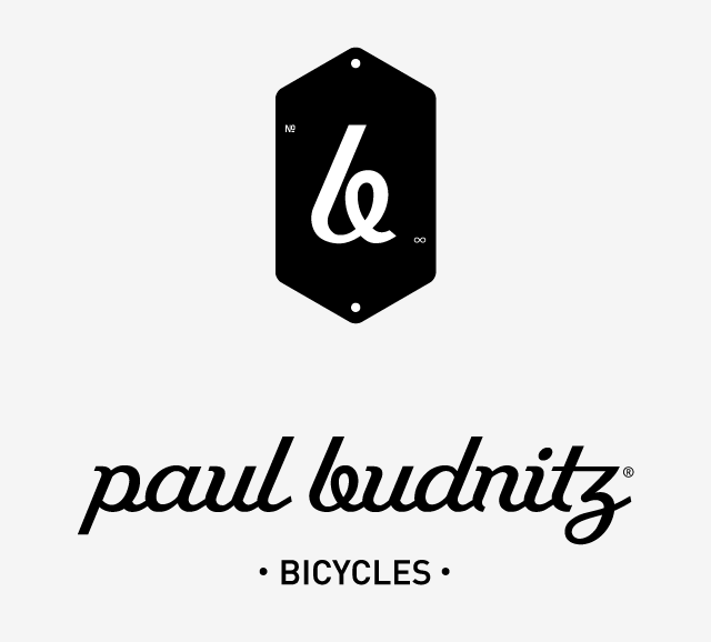
The branding has been designed to go across several mediums, even bicycle frames, and it works so well. The three elements that I think form the guts of the branding are the logotype (Paul Budnitz Bicycles), the logo mark and the stretched hexagon crest (which reminds me of the vintage bike companies, especially when on the frames) enclosing the logo mark.
The real genius is how the logo mark, the 'b' from the logotype, looks completely natural in the stretched hexagon and in the text-based logotype. I have tried this before and it is near impossible to achieve. A single letter taken from a logotype can look unbalanced on its own, or a single letter logo mark can look forced when it's shoe-horned into a logotype.
A really nice piece of work, kudos to Berger & Fohr.
(Image taken from bergerfohr.com. I, of course, lay no claim to ownership)