Back in October 2010, I launched my new shop, The Bleed Edge, an outlet for printed goods that I designed and produce here in Kildare. As you can read on this blog post, it was originally meant to be part of this site here, hence the similarities in design, dimensions etcetera.
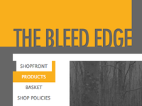 A few months in and I realised that I should’ve just designed the shop separately from the beginning. A shop is different to a blog, which I was aware of, but I didn’t have any extra time or resources to devote to a separate design.
Redesign, again
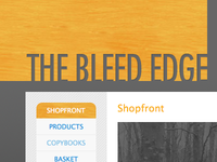
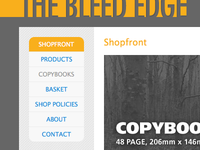 A few months ago, I started redesigned the shop. I actually did it quite publicly, posting in-progress works to my Dribbble account (and seen scattered around this post). It took me a while to get to the point where I was happy with the overall aesthetic- I wanted something clean, but not sterile, I wanted fun, yet not slapstick and I wanted smooth, not slick- the website is only a vessel for the products, not an end in itself.
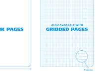 Speaking of products, I removed the screenprints that were previously listed. No particular reason; the ones that sold well are down in stock and the others aren’t going to sell without a serious push. Perhaps at some point in the future, I’ll have time to campaign.
Final Result
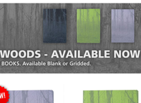 You can take a look for yourself- I am pleased with the final website. I worked a lot of expansion areas into the design and structure, for a time in the future when further products will be added (the not-too-distant future) and the website now has a news section for posting stuff relating to the shop. Previously news was posted through Twitter but that had a limitation or ten.
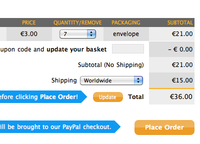 The one area which I am most proud of, is the shopping basket page. I spent a lot of time tweaking the different elements so that they all work well together on the page. I think I’ve made the basket very friendly to use and hopefully encourage people to spend their hard-earned cash on our Copybooks. If you have any suggestions, do please let me know.
Looking forward
 I have some Pixelcode t-shirts that I’ll be selling soon- they’re printed and ready to go, I just have to organise the promotional images, work out size charts and then I’ll be ready to go. I have some Copybook ideas that I want to work on too- I’m sourcing new colours for the covers and I want to develop a logo for the copybooks to stick on the cover. I’m thinking a crest or shield of some description. To keep informed, you can follow me on Twitter or Dribbble, where I’ll be posting my works-in-progress.