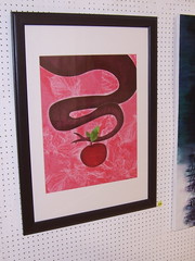
For the Athy Art Group annual exhibition (2010) I decided to create a couple of large digital prints rather than try create some new screenprints. I did this for two main reasons; time- I knew I was going to be busy in April and May (the exhibition is in June) and inspiration- I was really feeling inspired by an artist who produces mostly digital prints, Mr. Alberto Cerriteño. You should check out his blog, his Flickr page and his website (with shop), his work is really great, when I can, I am definitely going to buy some of his work.
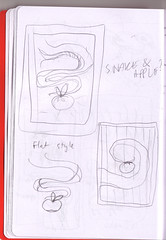
 I am always drawing and doodling into my sketch pads, but I find that when I redraw them (before scanning them in), I lose the spontaneity of the original sketch. To counteract this, I simply scanned in the original small thumbnail sketch that I initially created. Not perfect, by any means, but it was a start. From there I started toying with ideas and colours- I wasn't sure, beyond the very basic shapes, what way the prints would turn out like (at this point, I wasn't sure whether I'd get them done or not).
 I was going down the route of complete vector graphic, but then decided to add textures and shading in, which were Photoshop tasks, so I moved both of the prints out of Illustrator and into Photoshop. The files were large, but my trusty Macbook Pro handled them like a champ. I was stuck for imagery and textures to fill out the backgrounds and the little detail effects, so I had to go on a photo and scanning rampage- I took photos of a random assortment of textures and shapes and scanned pages from a number of very old books of illustrations. Combining photographs, colours and textures, the two prints were produced with similar elements to tie them together.
 I had decided early on that I wanted to create large prints, and I was planning on using Ikea frames, due to my requirements of a simple, cheap frame, to keep the price of the exhibiting pieces low. Although I think the frames were fine, I would've preferred if the frame mount was either regular in width or wider on the bottom of the frame. Obviously designed for hanging either horizontally or vertically, it was a slight irritation for me and my portrait-orientated prints.

I really enjoyed creating these prints and I hope to do more in the future. I plan on creating cropped smaller versions for smaller frames and I hope to sell them online really soon.
Full set of photos on Flickr.